Pain Rebels: Brand Identity System
Brand Design
Logo Design
Graphic Design

Background
Pain Rebels is a startup founded in 2024, focused on developing an app to teach users skills for managing chronic pain.
Problem
The startup needed a cohesive visual identity that could scale across both app and web platforms. The brand direction focused on communicating core values through a calm, trustworthy visual language.
Process
Sketched and iterated on multiple logo concepts, refining the strongest direction into a mark that remains recognizable at small sizes.
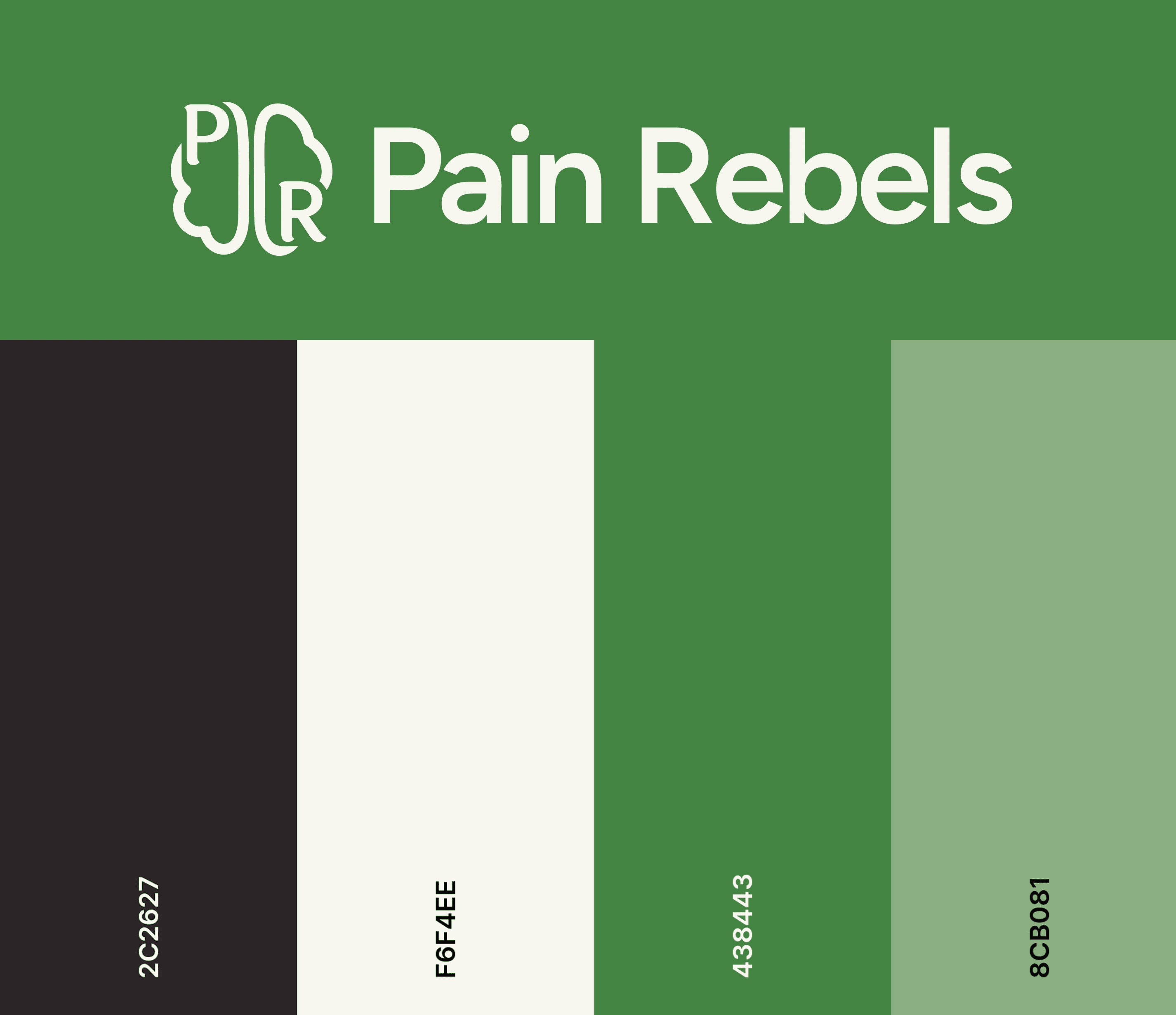
Researched color psychology and tested palette variations to identify tones that communicate trust and create a calm, supportive experience.
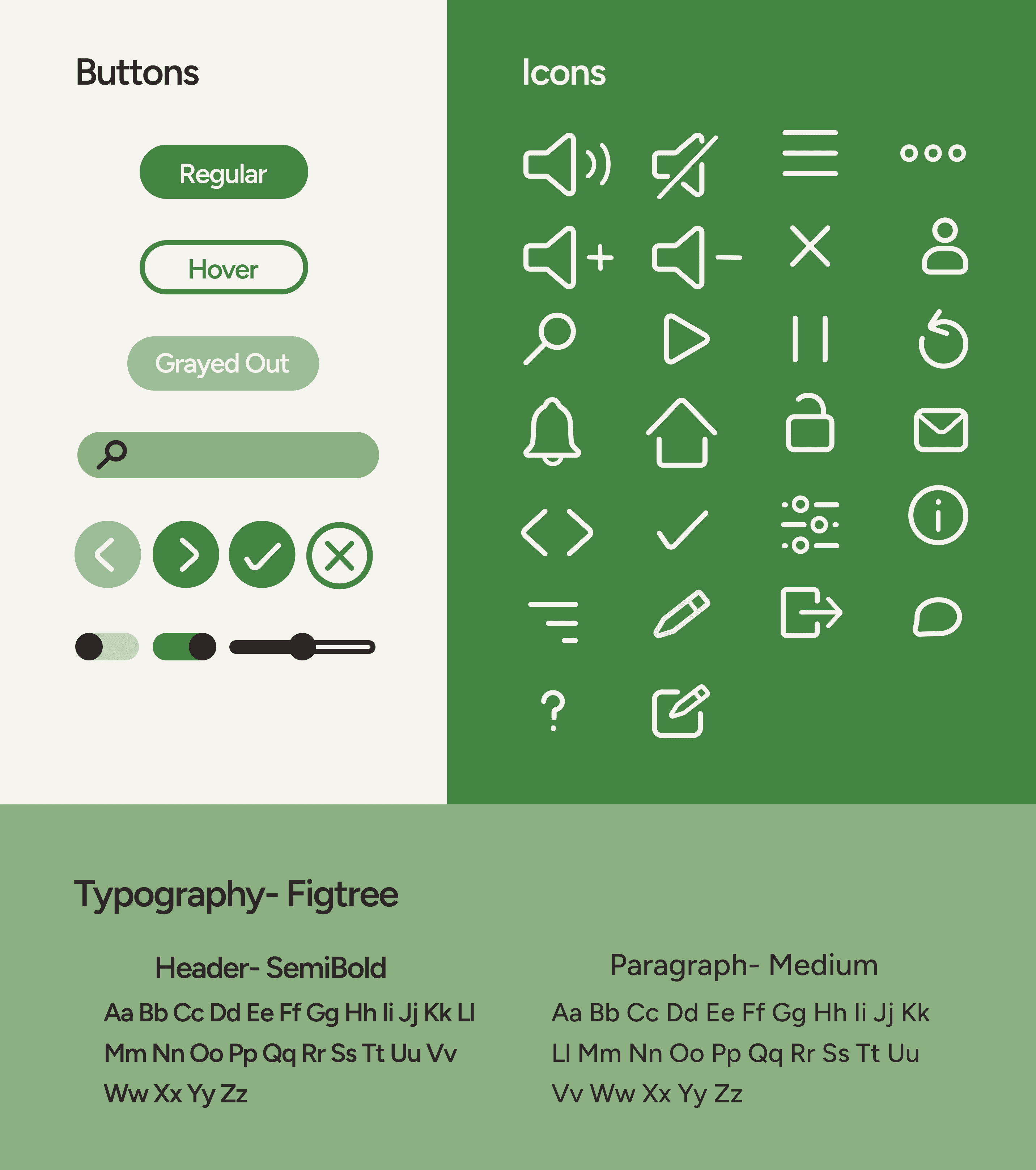
Evaluated and selected a typeface that balances readability, warmth, and professionalism.
Designed a simplified icon and button system to support clarity and ease of navigation on small screens, using bolder colors for primary actions to guide users.
Results
Created a cohesive brand identity that informed app and website designs, establishing consistency across all touch points.
Background
Pain Rebels is a startup founded in 2024, focused on developing an app to teach users skills for managing chronic pain.
Problem
The startup needed a cohesive visual identity that could scale across both app and web platforms. The brand direction focused on communicating core values through a calm, trustworthy visual language.
Process
Sketched and iterated on multiple logo concepts, refining the strongest direction into a mark that remains recognizable at small sizes.
Researched color psychology and tested palette variations to identify tones that communicate trust and create a calm, supportive experience.
Evaluated and selected a typeface that balances readability, warmth, and professionalism.
Designed a simplified icon and button system to support clarity and ease of navigation on small screens, using bolder colors for primary actions to guide users.
Results
Created a cohesive brand identity that informed app and website designs, establishing consistency across all touch points.