Pain Rebels: Mobile App UI
UI & UX
Brand Design

Background
Pain Rebels is a startup founded in 2024, focused on developing an app to teach users skills for managing chronic pain.
Problem
The app required an intuitive, visually consistent interface to guide users through key skills for pain management.
Process
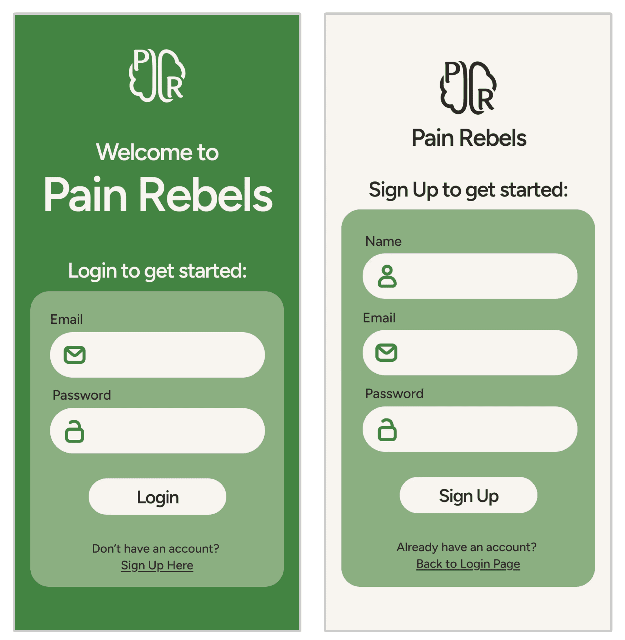
Used the completed identity system to design core screens, then extended these visual elements across additional pages to maintain consistency.
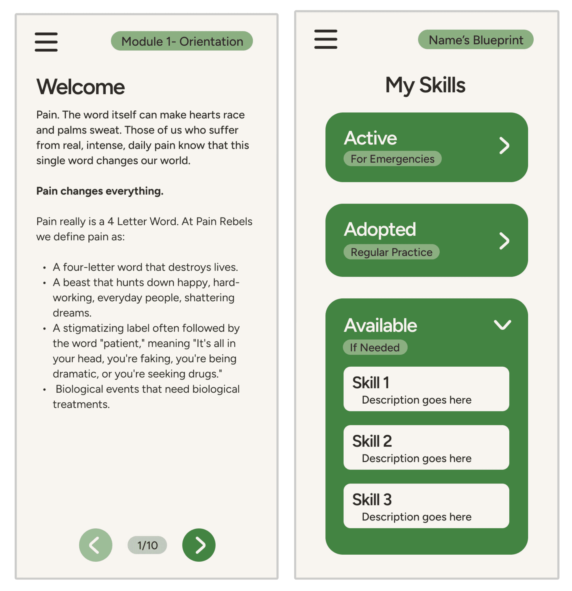
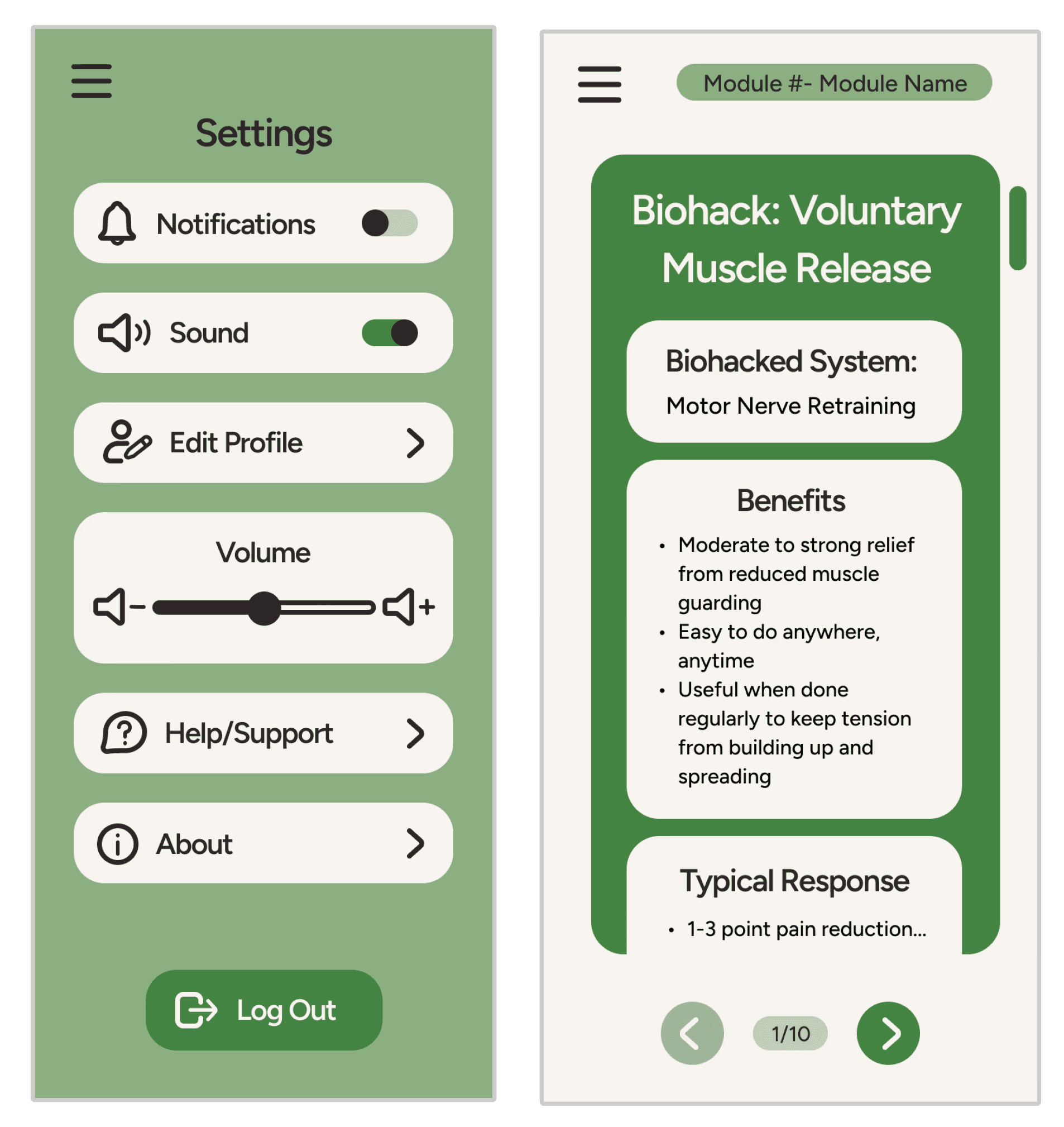
Organized content to guide users through key actions, using a “bubble” grouping system to present more information without increasing visual clutter.
Established clear visual hierarchy and intuitive navigation through intentional use of spacing, clean lines, and color.
Paid close attention to color contrast and type sizing to ensure accessibility and readability across screens.
Results
The completed UI designs formed the foundation of a functional prototype that demonstrated key user flows, including skill exploration and symptom tracking.
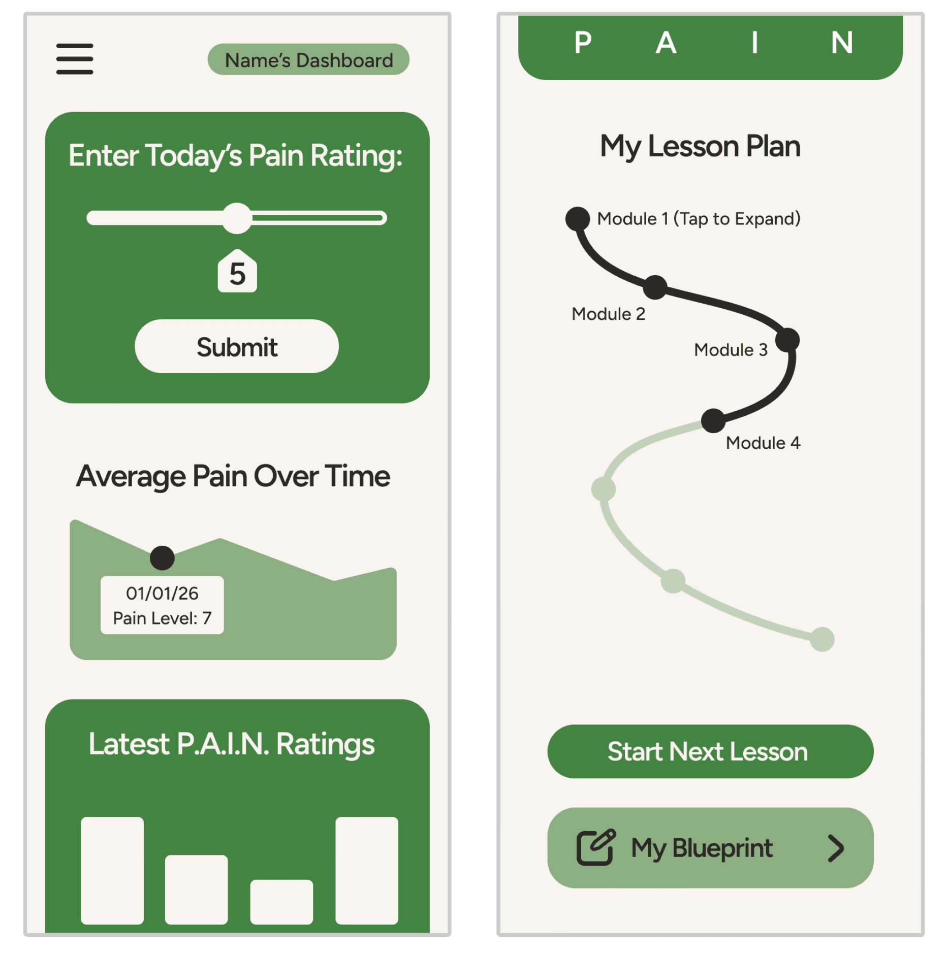
Dashboard (before & after scroll)
Background
Pain Rebels is a startup founded in 2024, focused on developing an app to teach users skills for managing chronic pain.
Problem
The app required an intuitive, visually consistent interface to guide users through key skills for pain management.
Process
Used the completed identity system to design core screens, then extended these visual elements across additional pages to maintain consistency.
Organized content to guide users through key actions, using a “bubble” grouping system to present more information without increasing visual clutter.
Established clear visual hierarchy and intuitive navigation through intentional use of spacing, clean lines, and color.
Paid close attention to color contrast and type sizing to ensure accessibility and readability across screens.
Results
The completed UI designs formed the foundation of a functional prototype that demonstrated key user flows, including skill exploration and symptom tracking.
Dashboard (before & after scroll)