Gifts of Music NW: Website Redesign
Website Design
UI & UX
Background
Gifts of Music NW is a local nonprofit community music school dedicated to making music education more accessible. The organization needed a website that better reflected its mission while making important information easier to find.
Problem
As Gifts of Music Northwest grew, new pages and content were added in different phases. This led to inconsistencies in visual styles and issues with hierarchy that made some information hard to scan and locate.
In this redesign, I focused on improving clarity and usability within the existing structure, while consolidating a few overlapping subpages and refining how content was organized and presented.
Key Challenges Included:
Inconsistent spacing, typography, and visual styles across pages
Weak hierarchy that made content difficult to scan
Navigation that felt dense in places
Lack of cohesive visual experience across the site
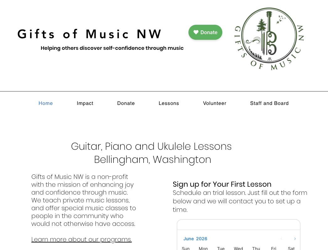
The site's original homepage
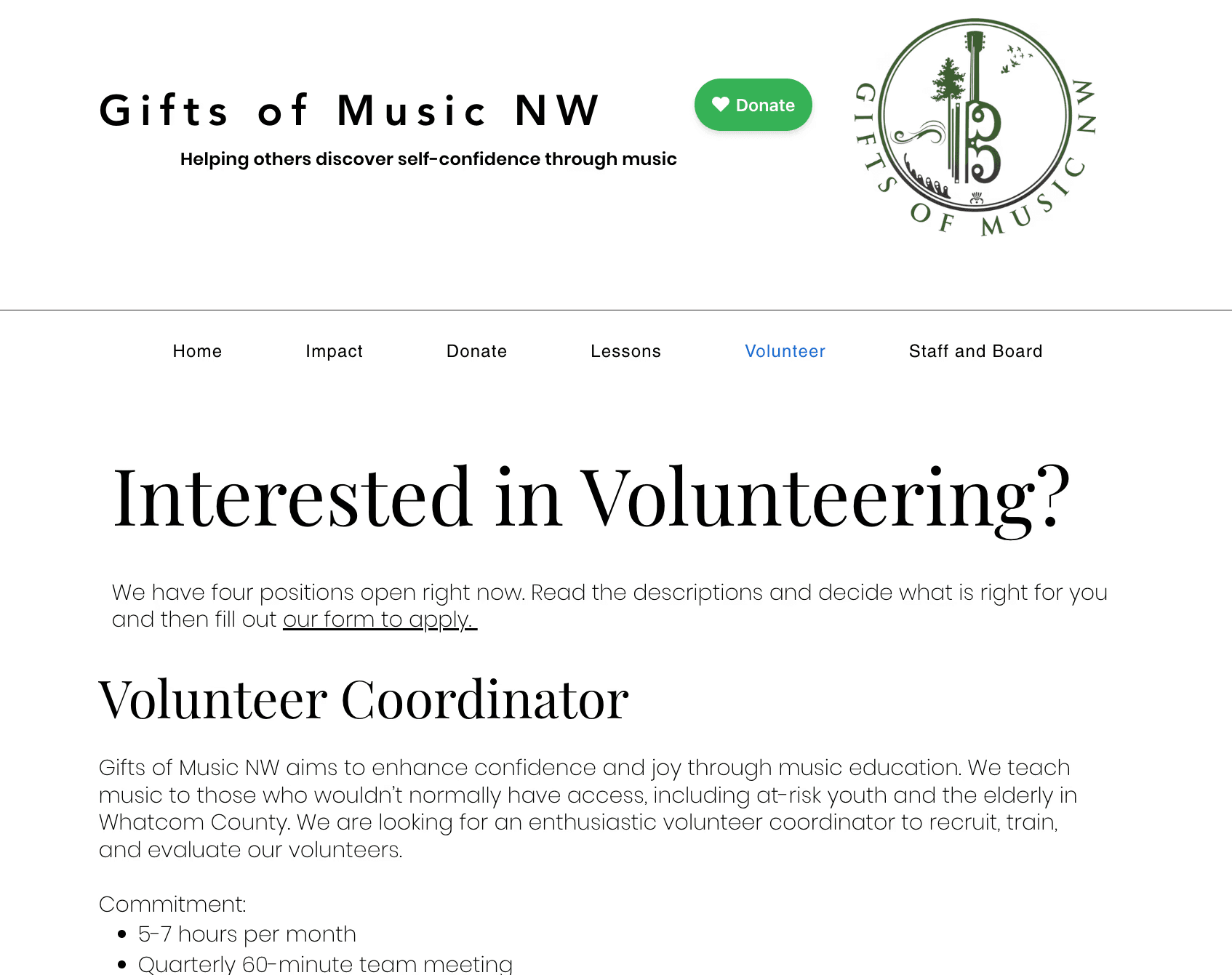
The site's original Volunteer page, which featured different header fonts and sizes
Process
Met with the organization's director to define project goals and establish a visual direction.
Developed a cohesive visual system with consistent typography, spacing, and UI components. I incorporated the existing logo and color palette to maintain brand recognition while creating a more polished experience.
Consolidated related subpages to simplify navigation and reduce unnecessary complexity.
Redesigned page layouts to improve readability, usability, and the visibility of key actions, including donating, signing up for lessons, and volunteering.
Results
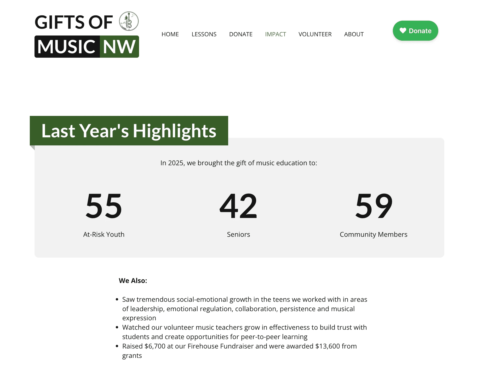
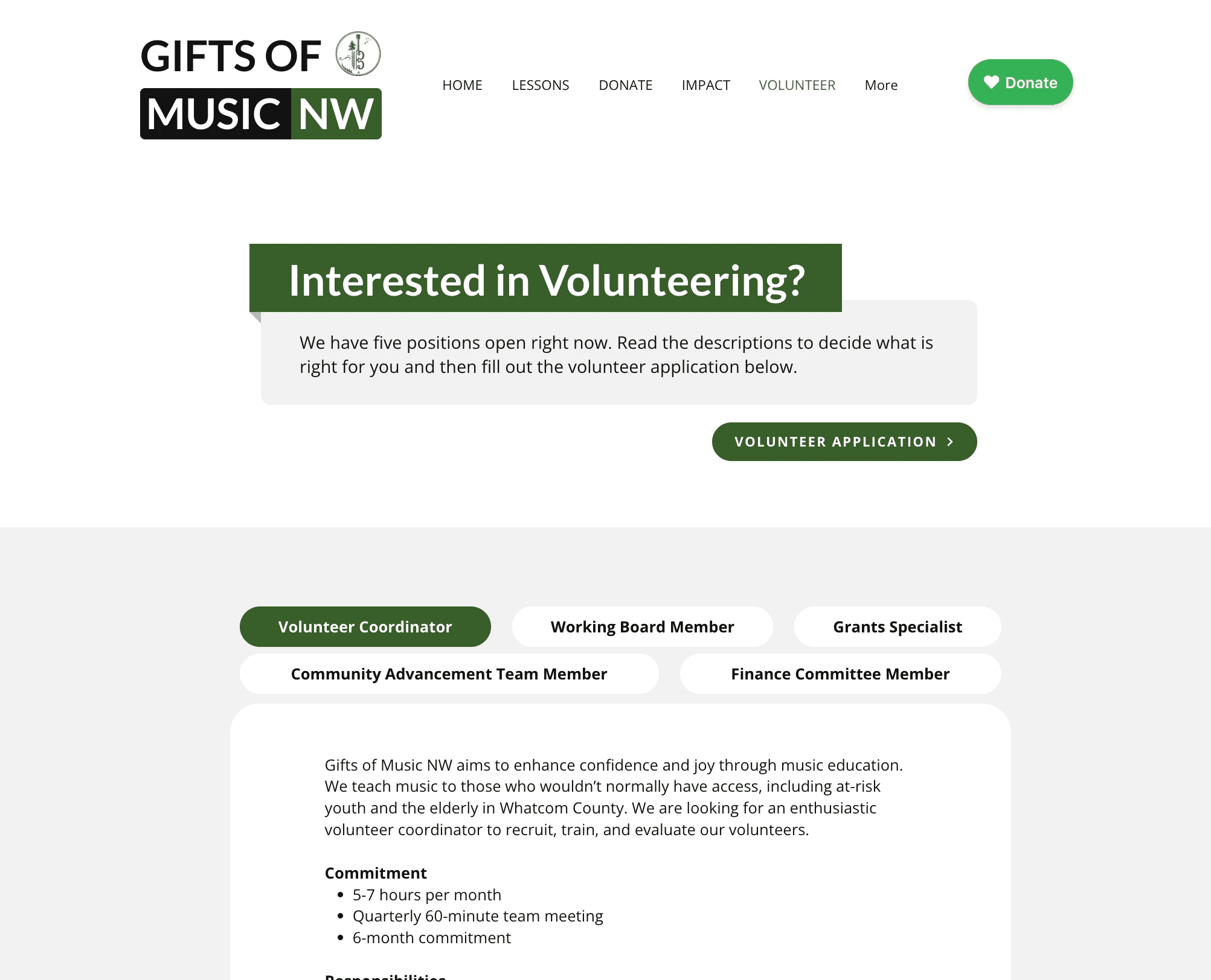
The redesign created a more cohesive and user-friendly experience that better communicates the organization's mission. Key improvements include clearer navigation and content organization, stronger visual hierarchy, more consistent branding, and greater visibility of key offerings.

Looking Back
This project reinforced the importance of balancing stakeholder goals with usability while maintaining a consistent design system as a website evolves. If I revisited this project today, I would migrate it from the Wix Editor to Wix Studio to create a more responsive experience across a wider range of devices.
Background
Gifts of Music NW is a local nonprofit community music school dedicated to making music education more accessible. The organization needed a website that better reflected its mission while making important information easier to find.
Problem
As Gifts of Music Northwest grew, new pages and content were added in different phases. This led to inconsistencies in visual styles and issues with hierarchy that made some information hard to scan and locate.
In this redesign, I focused on improving clarity and usability within the existing structure, while consolidating a few overlapping subpages and refining how content was organized and presented.
Key Challenges Included:
Inconsistent spacing, typography, and visual styles across pages
Weak hierarchy that made content difficult to scan
Navigation that felt dense in places
Lack of cohesive visual experience across the site
The site's original homepage
The site's original Volunteer page, which featured different header fonts and sizes
Process
Met with the organization's director to define project goals and establish a visual direction.
Developed a cohesive visual system with consistent typography, spacing, and UI components. I incorporated the existing logo and color palette to maintain brand recognition while creating a more polished experience.
Consolidated related subpages to simplify navigation and reduce unnecessary complexity.
Redesigned page layouts to improve readability, usability, and the visibility of key actions, including donating, signing up for lessons, and volunteering.
Results
The redesign created a more cohesive and user-friendly experience that better communicates the organization's mission. Key improvements include clearer navigation and content organization, stronger visual hierarchy, more consistent branding, and greater visibility of key offerings.
Looking Back
This project reinforced the importance of balancing stakeholder goals with usability while maintaining a consistent design system as a website evolves. If I revisited this project today, I would migrate it from the Wix Editor to Wix Studio to create a more responsive experience across a wider range of devices.